Pond 3D – Processing + Max/MSP

Inspired by Oskar Fischinger’s Optical Poem (video below), I created an array of rippling circles that would symbolize sounds. I used A 3D bouncing ball that changes direction to control the playback speed of the sounds. Both of these classes have bounce off of each other when they collide.

I started off messing around with Minim and Maxim, two sound libraries for Processing. But these libraries were not the most fun. I decided to try using Max/MSP since it’s been a while and Andy Sigler introduced OSC in a flyby as a way to send messages between programs. I got way too caught up in making the Max patch, and the Processing sketch doesn’t come across without sound, so unfortunately if you want the full experience you’ll need to download this Processing sketch and also run this standalone application created in Max/MSP.

Download Rippling_Pond3d_2.pde + Ripple.pde (class) + Frog.pde (class)

*bonus* download ripples_audioplayer.app (zip)

I have run into some processing questions: How is Z determined in P3D? Is there any way to angle ellipses or can they not be rendered in 3D? Gladys gave me the 3D idea, she thought it’d be cool if the ball made a ripple every time it hit the side of a 3d cube, and I started to go in that direction but gave up because I don’t understand 3D yet. I am psyched about OSC though.

This week I extended the rippling pond from last week. I was inspired by
CL Web: Relational Database

I’ve been messing with PHP Data Mapper, trying to set up a database for my little website. I created two tables in the database: Songs and Licenses. Each License is related to one Song (one to one). Songs can be related to many Licenses, or no licenses (One to Many). I haven’t quite made it that far but I did start using github.

view code

view website

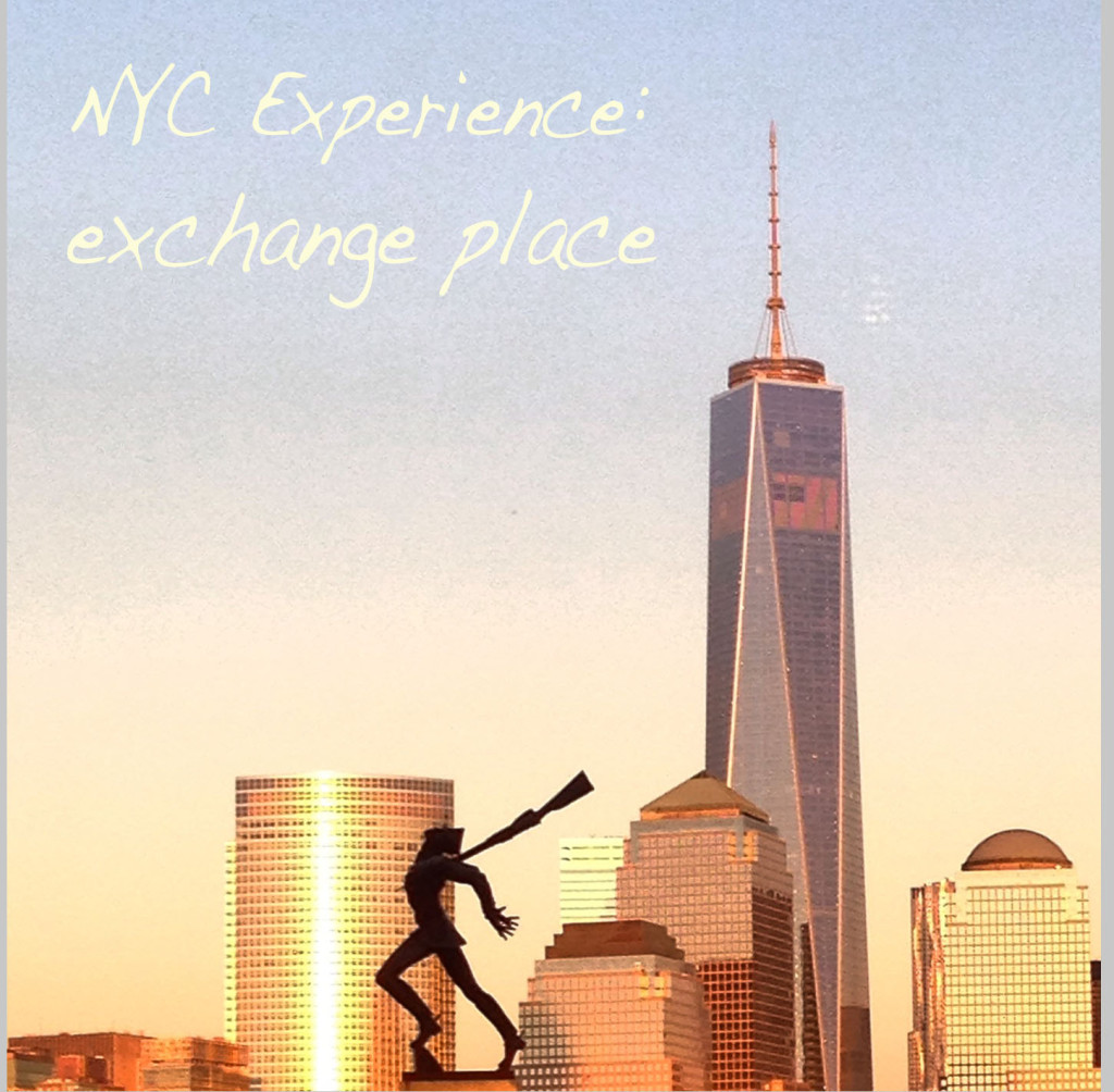
NYC Experience Design: Exchange Place

nycexperience_cover

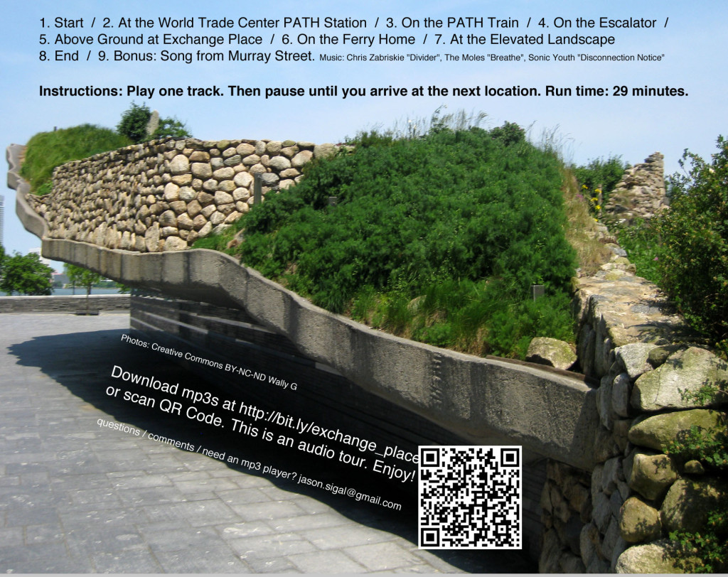
I used to commute to Exchange Place in Jersey City via the PATH Train from World Trade Center. On my commute, I noticed a lot of things, but I was also oblivious to a  lot of things. For example, there’s a ferry just a few blocks from the station, but it five years and a Hurricane before I finally tried this alternate route between WTC and NJ. It changed my whole perspective. I wanted to create an experience that captures this shift. The entire trip takes place in the shadow of the WTC but does not mention 9/11, instead I chose to spotlight memorials to events that may seem out of place.

Exchange Place, my NYC Experience Design project, is predominantly an audio tour. I narrated seven tracks in a voice inspired by the impersonal voices that emanate from the PATH station intercom. At the end of each track, the narrator gives directions to the listener who is asked to pause playback until they reach the next point. I started each track with a sound from the PATH and used background music to provide some continuity, but I worry that I did not provide enough continuity as far as the directions go. I also added two tracks of music to listen to at certain points along the journey.
I put my tracks on a CD-R, packaged with photographs of what can be expected on this experience. I also put a sticker on the front of the case to make sure that whoever selected this experience would be able to bring headphones and an mp3 player on their journey. I included mp3s on the cdr and there was also a download link + qr.

You can download the mp3s here and they are each tagged with images of what you would see while listening to them. Here are a few examples

neon_cc-by-genista

Neons for Exchange Place Station by Stephen Antonakos in 1989. Photo Creative Commons Attribution-ShareAlike Genista via flickr.

nycexperience_back

You can download the audio and take the tour yourself here.


Typography / Words as Images

Setting my name in Sans Serif

jasons_futurabold3


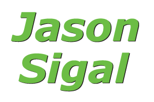
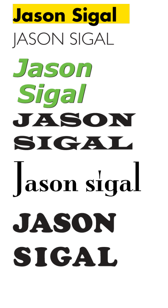
JavaScript-logoFutura Bold reminds me of the JavaScript logo, which happens to share my initials.

jasons_verdana

Verdana Bold Italic: I like the unique shape of the J, the symmetry between the I and L which both have ascenders above the cap-height, the high x-height, and the lowercase g descender looks good in the bottom/middle like this.

Verdana makes me think of Green. After making this, I learned that verde/green is part of the typeface’s inspiration, and that it was made my Microsoft. I guess this makes me nostalgic for Windows 95. I also learned that the design world thinks this typeface is boring.

“The Verdana fonts,” Microsoft explains, “are stripped of features redundant when applied to the screen. They exhibit new characteristics, derived from the pixel rather than the pen, the brush or the chisel.” Verdana, designed by Matthew Carter, serves technology not by seeming technological but with its leanness, height and loose spacing; it is bland, but efficient. The Ikea spokeswoman called it “a simple, cost-effective font.” (read more)

Coincidentally, IKEA caused an uproar when they switched their typeface from Futura (above) to Verdana.

jasons_gillsans

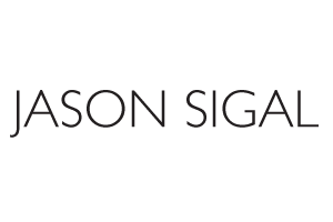
Gill Sans light…looks like a fashion designer logo. I like the descender on the J, and how it compares to the level L making a right angle at the right side. I like the angles and symmetry of A, N, S, I, O, and how the G is not quite an arrow.

Setting my name in Serif

jasons_widelatin

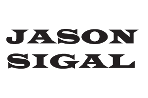
Wide Latin – I like these angled brackets connecting these serifs to their stems. Also, I didn’t have to adjust the kerning to get the words to align!

jasons_CooperBlack

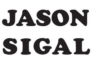
Cooper Black – This feels like a “back to school” typeface with fun, round, slab serifs. I like the stress of the O. To get the two words to align, I adjusted the kerning and fattened the stems of the I and L.

jasons_monalisa

Mona Lisa Solid ITC TT – Not sure where this one came from but it makes me think of classic Hollywood, Manhattan, Paris and film noir. I like the contrast between the low Xheight, and the gigantic giant stems of the J and L as bookends.

all_typefaces

Words as Images


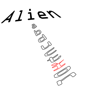
alien_abduction3 Alien Abduction – OCR A Std, an early computer font. It has some serifs but only to make each letter easily distinguishable via computer screens.

beer_stonesans_22

Beer – This is a modified Stone Sans. I hammered the B into a beercan shape (very unlike its original form) and rounded a lot of corners. I gave it a bold weight like a beer belly.

speak2 Speak – Arno Pro

Continue reading

Tone Lab

Yiyang took some videos of our experiments with tone generation during this week’s labs:

Those used photoresistors with a resistance threshold that would trigger tones. The tones for all three vary by a ratio when turning one of the pots. The other pot controls amplitude between the digital output and the speaker.

Later on I heard other students in the lab like TK an Dan doing really awesome stuff with arpeggios. So I experimented with each photoresister playing a looped arpeggio rather than a single tone. The pot controls how fast we loop through the arpeggio.

Code available here https://github.com/therewasaguy/Arpeggiator

PComp Observation: TAP ‘n GO

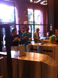
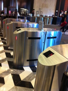
The TAP ‘n Go is an interactive entry/exit system for the Bobst Library. I became aware of this system the first time I approached the glass doors guarding the library entrance.

photo (21)   TAP 'n Go 1  photo (20)

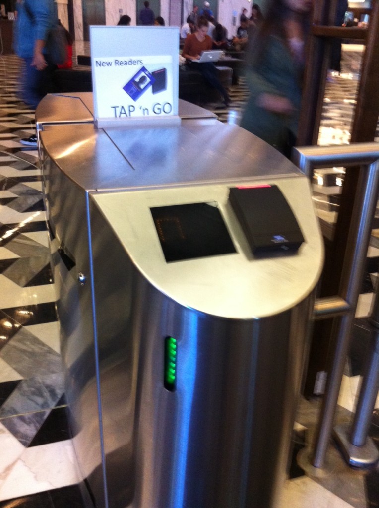
The sign that said “New Readers” was not relevant to me because I had never been here before to see the old system. But the name “Tap ‘n Go” and the image of a card was helpful because I understood that I could open the glass doors by using my card. It was not immediately clear which set of sliding doors would open (to my right or left) but I learned by following other people as they used the system.

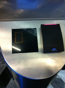
The yellow square on the front screen turns into an arrow that points in the direction of the glass doors you have just opened. The red light above the card scanner turns green as well, and a soft tone indicates that you may now enter. The green horizontal lightstrip on the side of each unit indicates that this is an entrypoint.

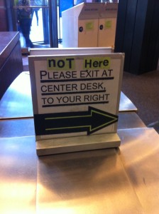
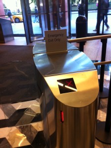
Once you are inside, the interface is reversed. The corresponding horizontal lightstrip is now red (instead of green) to indicate that this is not an exit. The yellow square is now a red X. There is no card reader. The signs say things like “Emergency Exit Only” and “Not Here.” If you try to exit through a Tap ‘n Go, there is a long, loud, sustained tone.

photo (24)  photo (23)  photo (22)

The proper place to exit is a scanner to ensure that nobody leaves the premises with unchecked library books. When somebody does, there are eight short tones to indicate an alarm going off, and the person guarding the entrance will inspect your bag.

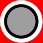
My first interaction with the Tap ‘n Go was very confusing. I watched other people use it to get an idea of what to do (scan my ID card), and which set of glass doors would open. But when I scanned my card, I got a green circle instead of an arrow and the doors did not open. I tried a few times at a few different card readers and finally made my way to the security desk where I was told “this happens” and to call Card Services. I called and explained the situation, my card was activated, the yellow square turned into a green arrow, the glass doors slid open, and I entered the Bobst Library.

I observed a similar encounter this afternoon. A woman wearing headphones tapped her card, and proceeded to walk towards the set of glass doors that had opened for the previous person to use that card reader. The doors did not open. Frustrated, she backed up and tried the same reader again. No opening. Shaking her head, she tried the adjacent card reader. Same result. And again and again, until she finally made her way to the security desk and had the same phone call with Card Services that I had had. During this time, she listened to headphones and read a book in the lobbyish area between the Tap ‘n Go system and the revolving glass doors facing the street. I asked her to show me what happens when she scans her card, but by this time, her card had been activated, so she followed the green arrow into the library.

This was the longest interaction I observed with the Tap ‘n Go. Other lengthy interactions included people who experienced a “hiccup” where their card did not read on the first try. These people tended to be doing something else while scanning their card, and I’m not sure whether their interface beeped at them or if they simply heard a tone from an adjacent interface. Most of the interactions were very short.

This design makes use of some of Norman’s Principles of Design—it takes shapes we are familiar with and we understand intuitively that the glass doors will open if we swipe a card over the black surface. But there is not visibility to the set of possible actions. To the user, there can only be two results—the card is read and the doors open, or the card is not read and something is broken. When there is a response—either a tone or an image changing from a yellow square to green circle— but the door does not open, this doesn’t provide enough feedback to the user about what is happening.

Chris Crawford defines interaction as an iterative cycle in which two actors listen, think, and speak. In most cases, the Tap ‘n Go interaction cycle only happens once: it hears a card scan, it thinks, and communicates the results with open glass doors. However, this everyday object lacks “interestingness” in its thought process, and also lacks clear communication in cases when an irregular result occurs. Crawford advocates for interactivity as a means for sustained engagement, but sustained engagement is not desirable for anybody who interacts with the Tap ‘n Go.

ICM Week 3: Many Ripples

Screen Shot 2013-09-24 at 1.16.28 PMI wanted to make circles that expand repeatedly from the center of a mouse click, so I made a ‘Ripple’ class that has the variables x,y, initial size, speed of expansion, and color. It had a function to reset itself at its initial size, to create an endless loop. The problem was that for every new mouse click, the old ripple would either disappear (if background() was in draw) or stop moving. I had a vague idea that an Array could solve this, but wasn’t sure how, and I thought it looked kind of cool just rippling out from the center of the screen anyway.

I passed the code along to Adarsh, my buddy for this week’s assignment. He introduced an ArrayList to contain each ripple, and saw some areas where the code could be improved. He used an ArrayList instead of a plain old Array because in the latter, we’d need to know how many ripples there are, but we can keep adding/removing from a list. With the ArrayList in place, he got MousePressed working.

Where we’re at so far: MANY RIPPLES (view online  // source code).

Screen Shot 2013-09-24 at 1.17.16 PM

if you click, 5 ripples are added to the arraylist. On KeyPressed, the last five ripples are removed. I talked with Adarsh about some ways we could keep going with this, he’s interested in trying P

Signage

This week, we read The Secret Language of Signs: the most useful thing thing you pay no attention to. I have been paying a lot of attention to signs everywhere I go. I think that most signs around NYC are a-ok—they’re not great, but they’re not horrible, and they serve a purpose, they get the job done given their circumstances.

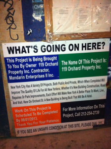
WHAT’S GOING ON HERE?

whatsgoingon2

The “What’s Going On Here” signs at city construction sites are an example of a sign that “gets the job done.” Nobody cares to read about why the construction is happening, they just want to get where they’re going, but for some reason (the law?) these wordy signs appear wherever there is construction. They are not designed to be read in full and I have to believe that this is intentional. The colors are a little bit jarring, but for anyone who might be wondering “what’s going on” they’ll see that title up top nice and clear and they can read all about it and get even more information if they are so inclined. Still, the sign could be condensed, the colors could be less in-your-face / boring, and an image could go a long way.

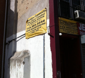
BROOKLYN COMMUNITY DAY CARE CENTER

bkcommunitydaycare

This sign for Brooklyn Community Day Care Center looks like it might a s well be a sign at a construction site. The text is small and hard to read. The most important thing (the first to catch your eye) is the phone number because it’s in bold. The color scheme looks like a warning/caution sign, not a sign for a day care center. This sign needs to highlight that it is for a daycare center because that message is lost.

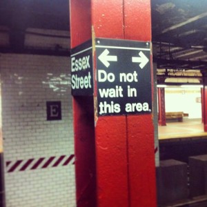
DO NOT WAIT IN THIS AREA

donotwait


This sign is confusing because it’s placed at a subway platform where people have nothing to do but wait. Why can’t they wait in this area? How far does the area extend? These questions are not answered by this sign or by any other signs. So people inevitably ignore the sign and wait in this area. No harm done, right?

USED CARS

This sign has a clear message and every design choice supports the message. Used Cars is the spotlight, and then you see that they’re also safe. The color scheme and typography support the nostalgia feeling of a classic car, maybe you’ll find the car of your dreams here.

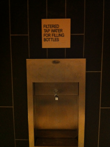
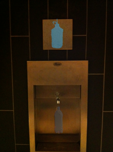
WATER BOTTLE FILLING STATION

tap_for_WB_orig

I saw this sign and thought I could make it better…the typography is nice and clean/clear but I think the message could be conveyed without any words (similar to how a STOP sign is better conveyed by the red shape than the words).

tap_for_wb_reviseI don’t know if I succeeded, it’s just a prototype. Maybe the top section is not needed and there could just be one water bottle, but the top sign is at a better level to catch the eye. Continue reading