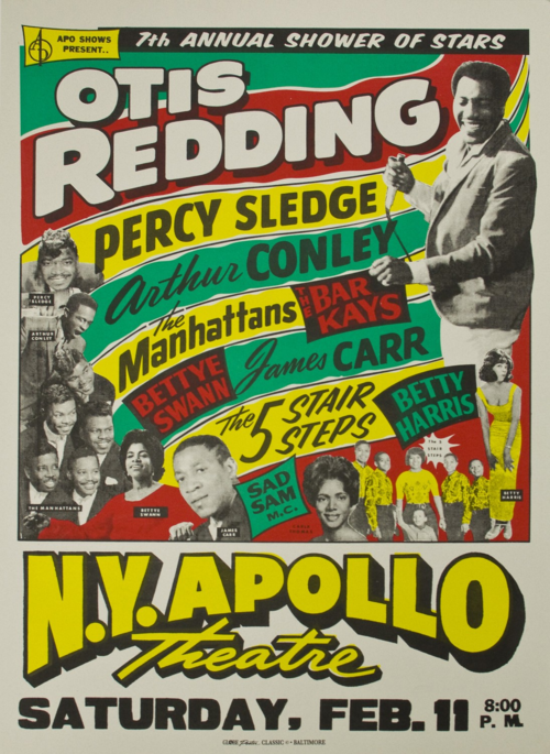
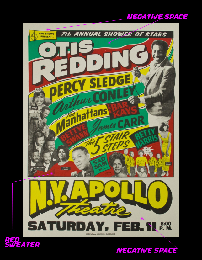
A framed print of this iconic neon poster caught my eye earlier this year. For this assignment (to analyze a piece based on the Principles of Design), I did some research and found that it was printed in 1967 by the legendary Globe Poster in Baltimore, screenprinted on letterpress with Day-Glo ink (more info here).
Principle of Design #1: UNDERLYING GRID
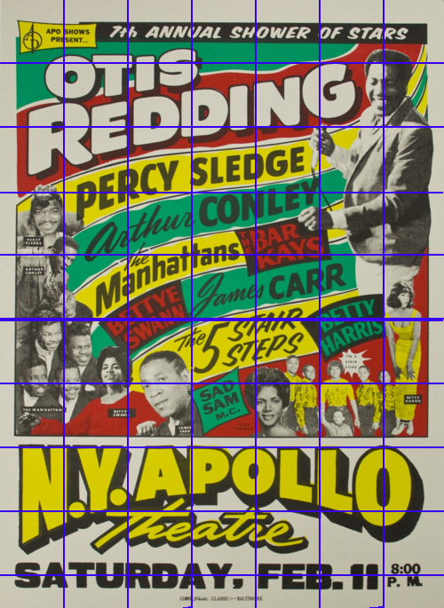
First I looked for a straightforward grid…
Some parts of the poster adhere to this grid, especially the top and bottom. But in the upper two-thirds, there are so many curvy, angled lines that I really felt like there were other grids in action:
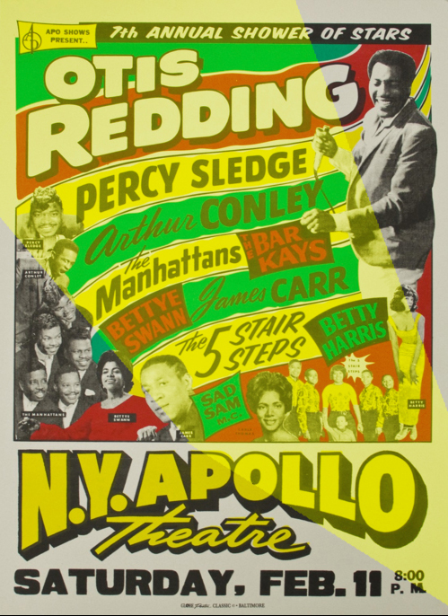
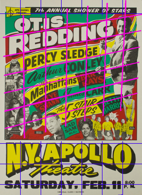 Still, the grids don’t quite capture what’s going on in that upper area. I traced a horizontal line from Sad Sam to Percy Sledge. And another from Betty Harris to Otis Redding holding the mic.
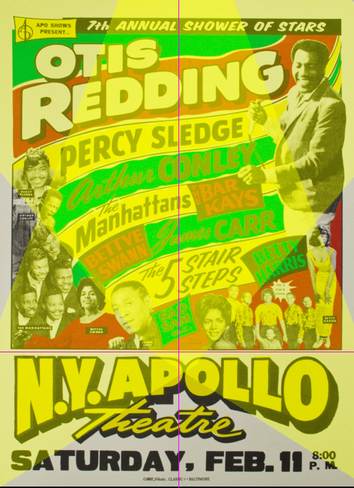
I think this line is reinforced by Sad Sam’s face, and the angle of the first L in Apollo, and the way the Manhattans are arranged. Then I saw another symmetrical horizontal line:
Together these spotlights contain all of the performing artist photos, and they look kind of like a Hollywood spotlight, which would fit the theme of this poster. The spotlights might just be my imagination. but I believe they are reinforced by the placing of artists and the curve of “NY Apollo,” where the two spotlights intersect at the vertical center of the poster, in a spot that divides the performers from the venue/show info. So in my interpretation of the poster, there are invisible spotlights.
Principle of Design #2: TYPEFACE
One of the principles of design tells us to limit typography to one or two typefaces, usually one serif and one sans serif. But this poster totally violates the rule! There are TONS of typefaces—at least five by my count, possibly as many as seven (unfortunately it’s hard to see the smallest ones in this lo-res digital file).
Upon closer inspection, I think the last three are different weights of the same font, also used for Bettye Swann, Betty Harris, The Bar Kays, Carr and Conley. “Otis Redding” and “Apollo” might also be variations on this same font with some shadowing. I think that font is either Proxima Nova or Bluset, however “Saturday” looks like more Wooddale Condensed Regular. The first font looks like Okay. I had trouble using What The Font with some of these clips because they’re pretty much all warped.
The typeface is interesting because it is so expressive and rather than pairing sans with a serif, sans is repeatedly paired with a cursive script (is there a name/category for cursive?). Why are the first names of James Carr and Arthur Conley written in cursive, while Percy Sledge is all bold (same font as Carr and Conley last names only). I don’t know, but it looks cool, and the typefaces contrast really well with each other to help paint a picture that this is going to be an exciting event with a lot of distinct stars.
Principles of Style #3 & 4: HIERARCHY OF ELEMENTS & NEGATIVE SPACE
Otis Redding is clearly the headliner here, and the details about the venue and date are presented in clear readable typeface with plenty of space around them. For example, Otis Redding is the only artist who gets two background colorstrips, and the venue/date info are surrounded by negative space. I especially like how Bettye Swann’s shirt blends in with the red negative space to become part of the background, but also helping draw a line between her and The Manhattans. The labels for each artist’s photograph are tiny enough to stay out of the way, which is good because their names are already listed on the poster. They’re laid out in a way that helps people make sense of who’s who, but the additional nametags aren’t completely redundant because it’s not immediately clear, especially in the case of Carla Thomas (bottom center). With all these artists on the bill, there is a lot of information to take in here, and, even though it’s given a prominent position at the top without any background distractions, it’d be easy to miss the name of the event itself—”Shower of Stars.” I like how each artist gets their own spotlight, and the typefaces and design choices all serve to emphasize that this is a “Show of Stars.”
Principles of Design #5: COLOR
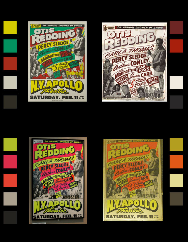
I was drawn to this poster because of its vibrant neon color. But I’m not sure if the designer had a specific color in mind, because I’ve found several versions of this poster. This might indicate that the poster was screenprinted with a few different color schemes following the same color guidelines. The one I’ve used has erased Carla Thomas’s name from the bill some reason (otherwise we’d add one more typeface to the above list). Maybe she had to cancel her appearance at the Apollo on this tour, but played shows at other stops along the way, and the composition of faces was too good to remove her face from the poster which would explain why her face is still on the green bill. Each of the other color schemes is vibrant in its own way, and I read that they used Day-Glo ink made out of fish scales to catch people’s attention even at night.
