FLOW The Psychology of Optimal Experience (Mihaly Csikszentmihalyi). Continue reading
Fall 2013
I’m inspired by Scratch, a visual programming environment for kids that exists entirely in the browser. There is a community with over 3million projects, from animated stories and games to music, almost all produced by kids! You can “look inside” to see the code, and remix any project under a Creative Commons license. >> http://scratch.mit.edu/
Speaking of Creative Commons, I make some of my music available under a license that allows noncommercial use, and if I’m lucky sometimes I get inquiries from people who want to use it commercially. I know I’m not the only one. So for our calculator assignment, I made a little PHP to calculate a fee based on what type of project and the budget. All the variables and numbers are just placeholders for now, but I’ve had this project in mind for a long time and I’d love to keep developing. Here’s the BOPD PHP Calculator
It has been a fun week of labs. At one point, I thought I fried my Arduino because it stopped responding, but a reset seemed to do the trick.
I decided I like to put LED indicator lights on my breadboard. For example, I’ve been putting an LED after the Mouse On switch. First it’ll go to Digital Input, then LED small leg (cathode), then resistor 10k (brown, black, orange). LED big leg (anode) and resistor connect to ground.
I was confused by Lab 2 part 2 where we were prompted to map(analogValue, 0.0, 5.0) with only three arguments. Don’t we always need five? I got an error until I added two more values, but wasn’t sure what top put there cuz the values I added shaped my mapping results.
Q: Why do we use delay between readings?
Q: If you make a led digital output pin an “input” will that fry an LED?
I’m inspired by motion with photoresistors.
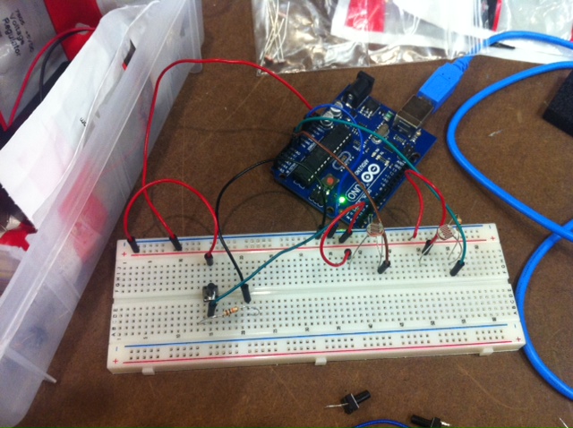
I also got a joystick that connects with power to both + inputs, analog output from L/R and U/D, and output to ground. So 5 pins to get it working properly.
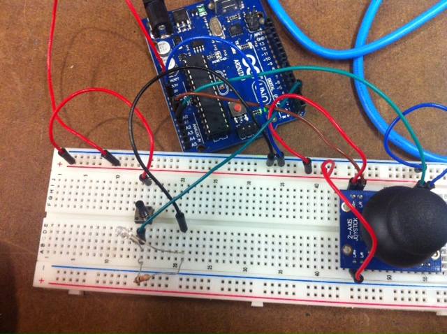 Notice the LED next to the mouse-on switch (to the left). Wish my joystick had a ‘select’ button, it just has two potentiometers.
///Some notes from this week’s readings:
Donald A. Norman – The Design of Everyday Things
- visibility, clues, feedback on action. “natural design”
- if it’s hidden, it’s invisible, and might as well not exist. Example: the lost telephone hold function.
- if unused functions, “purpose of design is lost”
- psychology of how people interact with things
Afford “is for” – like the affordances of a chair: it’s for carrying weight, it’s for sitting.
Constraints & Mappings
Principles of Design: 1.) Visibility 2.) Provide a Good Conceptual Model (to predict effects of actions)
“a device is easy to use when there is visibility to the set of possible actions, and the controls display natural mappings”
Conceptual Model – Designer’s Model vs. User’s Model’ vs System Image — make visible
“Emotional Design” is Norman’s response to people who thought he didn’t care how things look, just how they function. He describes three teapots in his collection, including one that is impossible to use, but he loves all three anyway. He references studies that show how our gut emotional response impact our interactions. Emotion is primal. If something is unnatractively designed, we’ll focus on it more and maybe even figure out how to use it if necessary, unless we’re stressed out (follows a U-curve). If we are attracted to an object, we’ll enjoy using it more and we’ll be more playful in our interaction.
Physical Computing’s Greatest Hits (and Misses) is a great overview of some of the ways to use the tools we have learned so far. I love the Megatap 3000.
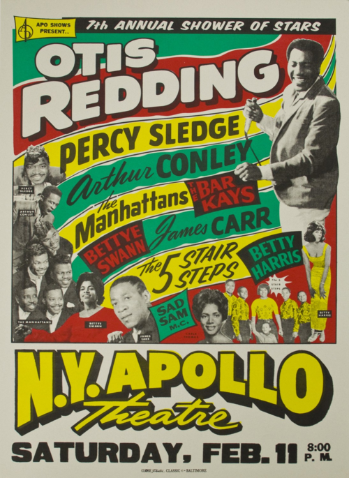
A framed print of this iconic neon poster caught my eye earlier this year. For this assignment (to analyze a piece based on the Principles of Design), I did some research and found that it was printed in 1967 by the legendary Globe Poster in Baltimore, screenprinted on letterpress with Day-Glo ink (more info here).
Principle of Design #1: UNDERLYING GRID
First I looked for a straightforward grid…

Some parts of the poster adhere to this grid, especially the top and bottom. But in the upper two-thirds, there are so many curvy, angled lines that I really felt like there were other grids in action:
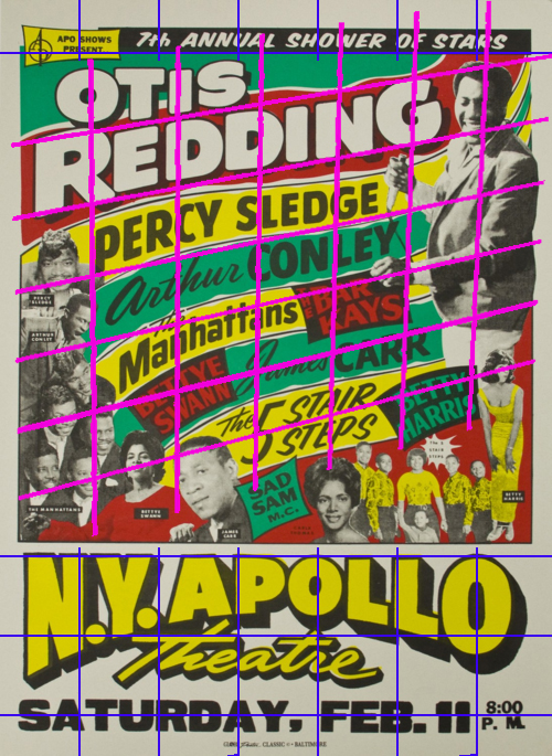 Still, the grids don’t quite capture what’s going on in that upper area. I traced a horizontal line from Sad Sam to Percy Sledge. And another from Betty Harris to Otis Redding holding the mic.
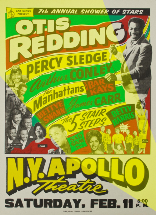
I think this line is reinforced by Sad Sam’s face, and the angle of the first L in Apollo, and the way the Manhattans are arranged. Then I saw another symmetrical horizontal line:
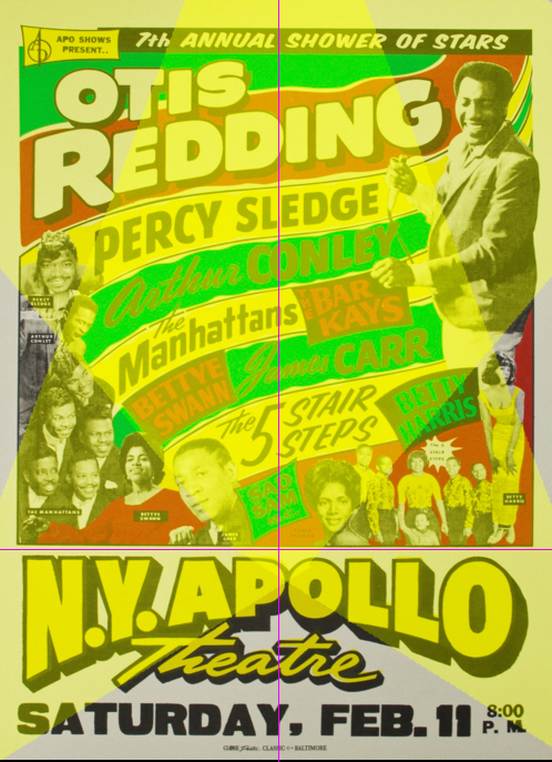
Together these spotlights contain all of the performing artist photos, and they look kind of like a Hollywood spotlight, which would fit the theme of this poster. The spotlights might just be my imagination. but I believe they are reinforced by the placing of artists and the curve of “NY Apollo,” where the two spotlights intersect at the vertical center of the poster, in a spot that divides the performers from the venue/show info. So in my interpretation of the poster, there are invisible spotlights.
Principle of Design #2: TYPEFACE
One of the principles of design tells us to limit typography to one or two typefaces, usually one serif and one sans serif. But this poster totally violates the rule! There are TONS of typefaces—at least five by my count, possibly as many as seven (unfortunately it’s hard to see the smallest ones in this lo-res digital file).
![]()

![]()


![]()

![]()
Upon closer inspection, I think the last three are different weights of the same font, also used for Bettye Swann, Betty Harris, The Bar Kays, Carr and Conley. “Otis Redding” and “Apollo” might also be variations on this same font with some shadowing. I think that font is either Proxima Nova or Bluset, however “Saturday” looks like more Wooddale Condensed Regular. The first font looks like Okay. I had trouble using What The Font with some of these clips because they’re pretty much all warped.
The typeface is interesting because it is so expressive and rather than pairing sans with a serif, sans is repeatedly paired with a cursive script (is there a name/category for cursive?). Why are the first names of James Carr and Arthur Conley written in cursive, while Percy Sledge is all bold (same font as Carr and Conley last names only). I don’t know, but it looks cool, and the typefaces contrast really well with each other to help paint a picture that this is going to be an exciting event with a lot of distinct stars.
Principles of Style #3 & 4: HIERARCHY OF ELEMENTS & NEGATIVE SPACE
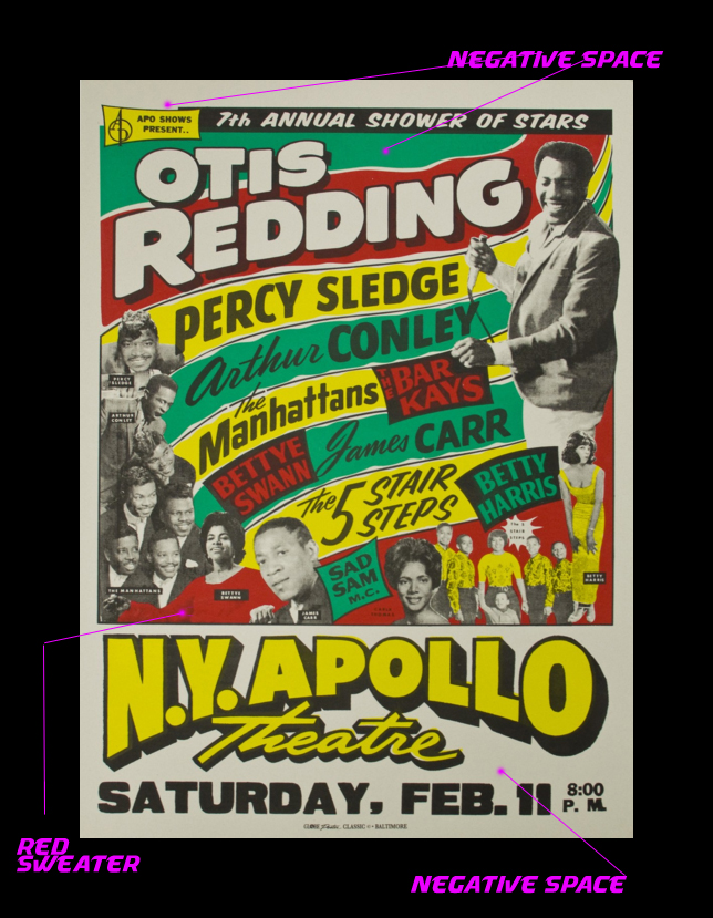
Otis Redding is clearly the headliner here, and the details about the venue and date are presented in clear readable typeface with plenty of space around them. For example, Otis Redding is the only artist who gets two background colorstrips, and the venue/date info are surrounded by negative space. I especially like how Bettye Swann’s shirt blends in with the red negative space to become part of the background, but also helping draw a line between her and The Manhattans. The labels for each artist’s photograph are tiny enough to stay out of the way, which is good because their names are already listed on the poster. They’re laid out in a way that helps people make sense of who’s who, but the additional nametags aren’t completely redundant because it’s not immediately clear, especially in the case of Carla Thomas (bottom center). With all these artists on the bill, there is a lot of information to take in here, and, even though it’s given a prominent position at the top without any background distractions, it’d be easy to miss the name of the event itself—”Shower of Stars.” I like how each artist gets their own spotlight, and the typefaces and design choices all serve to emphasize that this is a “Show of Stars.”
Principles of Design #5: COLOR
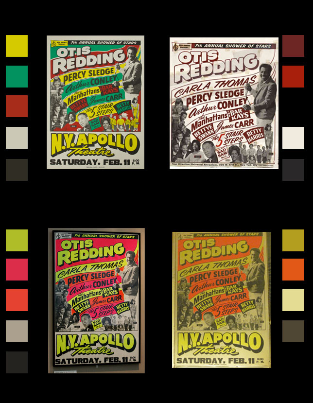
I was drawn to this poster because of its vibrant neon color. But I’m not sure if the designer had a specific color in mind, because I’ve found several versions of this poster. This might indicate that the poster was screenprinted with a few different color schemes following the same color guidelines. The one I’ve used has erased Carla Thomas’s name from the bill some reason (otherwise we’d add one more typeface to the above list). Maybe she had to cancel her appearance at the Apollo on this tour, but played shows at other stops along the way, and the composition of faces was too good to remove her face from the poster which would explain why her face is still on the green bill. Each of the other color schemes is vibrant in its own way, and I read that they used Day-Glo ink made out of fish scales to catch people’s attention even at night.
 Mitchel Resnick is the director of MIT Media Lab’s Lifelong Kindergarten Group. In a paper called All I Really Need to Know (About Creative Thinking) I Learned (By Studying How Children Learn) in Kindergarten, Resnick defines “Kindergarten-style learning” and explains why he believes it is essential for people of all ages—it even guides his own approach to designing educational technology like Scatch and Cricket.
Resnick defines the Kindergarten approach as a cycle, pictured at left, and I’ll reflect on each component below:
Imagine – Resnick’s role is to design for designers—kindergarteners of all ages. he is inspired by Friedrich Froebel’s pioneering vision of the first Kindergarten, where he presented a room full of materials (“Froebel’s Gifts”) that serve as the building blocks for creativity.
Here, Resnick identifies an interesting design challenge: the environment and its gifts must be general enough to allow for creative applications beyond what Froebel himself could have imagined. But there need to be some boundaries; the environment also be specific enough to be easily understand so that learning can take place.
Create – design environments made up of building blocks (i.e. Froebel’s Gifts) for designers to construct
Play – Resnick critiques other approaches like “Edutainment” which seem to view education as if it were a bitter-pill that must be sugarcoated in entertainment. Edutainment combines two passive things that we might expect people to provide for us. By contrast, Kindergarten style is active, emphasizing learning through play. Resnick believes that play is “intimately linked” with learning because both involve “experimentation, exploration, and testing the boundaries.” Scratch, encouraged to “Play with code”
Share – important in what Henry Jenkins calls our increasingly “Participatory Culture.” Learn from each other, as a community, exemplified by Scatch’s website of open source games. So not only play/tinker with your own code, but with each other’s.
Reflect – document the process. Reminds me of ITP where we’re encouraged to document everything, hence this blog. It’s one thing to get something working once, but another to be able to recreate it and tinker with it down the line. I love these reflections from children who participated in a workshop utilizing Cricket workshop, who observed that it’s important to…
Start simple
Work on things that you like
If you have no clue what to do, fiddle around
Don’t be afraid to experiment
Find a friend to work with, share ideas!
It’s OK to copy stuff (to give you an idea)
Keep your ideas in a sketch book
Build, take apart, rebuild
Lots of things can go wrong, stick with it
…Failed experiments can be part of the learning process as long as they are supported by these sorts of encouraging reflections. Resnick called the workshop a success because the children not only learned, but learned how to learn.
Resnick’s approach to learning isn’t limited to kindergartners, but geared to learners of all ages, and he follows this approach himself when designing software like Scratch and Cricket. There are a lot of parallels to the way we approach learning at ITP, a program that provides a community of learners with certain building blocks and then encourages us to play with these tools, we share our work with each other often through open source code, and share skills through group prototyping, we document/reflect on everything, and then we iterate in an imaginative cycle.
Resnick’s “Kindergarten approach to learning” reminds me of Chris Crawford’s definition of “Interaction,” which I read for this week’s Physical Computing course at ITP. Both authors call for iteration through a cycle of steps. Crawford defines interaction as two actors Listening, Thinking, and Speaking. Resnick adds step because he wants to see learning take place through interaction. Crawford is writing for interaction designers, while Resnick is writing for what I might call “education designers” who are designing experiences/environments for young designers to take part in the programming. Interaction Designers are different from User Interface Designers because the former tweak the “thinking” aspect of the interaction, i.e. core functionality that is not traditionally made available to User Interface Designers. Resnick takes things a step further because he believes that if we can put “thinking” into the hands of the people who are interacting with the technology, that is the key to learning.
When Resnick refers to “designing for designers,” sometimes I wonder if this is always the best approach to learning? It’s not like all children are going to grow up to become designers…
![]() :: Dale Dougherty has some persuasive answers to this question in his article The Maker Mindset. The founder of MAKE Magazine and, more recently, the nonprofit Maker Education Initiative, Dougherty believes that the Maker Mindset can transform education.
:: Dale Dougherty has some persuasive answers to this question in his article The Maker Mindset. The founder of MAKE Magazine and, more recently, the nonprofit Maker Education Initiative, Dougherty believes that the Maker Mindset can transform education.
The Maker Mindset builds off of Carol Dweck’s book Mindsets in which the Stanford psychology professor found that some people have “Fixed Mindsets”—meaning they believe that their knowledge/abilities have a limit and they’re pretty close to maxed out—while others have “Growth Mindsets.” People with a Growth Mindset believe they can do anything they put their mind to, and Dougherty emphasizes how essential this becomes in a world that is constantly changing. The Maker Mindset is a type of Growth Mindset through which people believe they can turn their ideas into reality. This is achieved by constantly experimenting, tinkering, and pushing the boundaries of what’s possible using what you already know. In the process, you’ll expand your own body of knowledge and probably create some cool things. Dougherty acknowledges that makers are not mainstream these days, driven largely by internal goals rather than external/social rewards. But he believes that Make can be even more of a social mindset if it is built around sharing, and that this starts with education.
To bring the Maker Mindset to education, Dougherty calls for the development of projects, kits and curricula. He wants young people to take leadership roles and join communities outside of school. Communities can provide exhibition space for makers that invites and inspires further participation. Dougherty believes that a record of participation in maker communities could be a valuable part of a young person’s résumé. What Resnick described as passive “edutainment,” Dougherty might call “consuming” and he believes that education by making things is the best way forward.
I’m not sure how I feel about the way Dougherty has built a brand out of the word “MAKE”, but I certainly do admire his mindset!
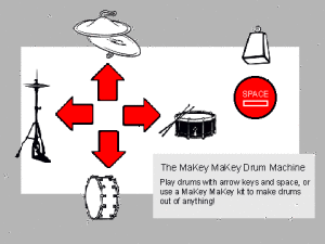
MaKey MaKey Drum Machine using Scratch
:: In Designing For Tinkerability, co-authors Resnick and Eric Rosenbaum critique Make’s approach because it is sometime narrowly misinterpreted as “making” physical things when really, for these guys, it’s more about the broad approach to making no matter the form. Tinkering is too often in the shadow of the more logical Planning, they argue, but in fact the ability to improvise and incorporate bricolage is increasingly essential. Resnick and Rosenbaum go on to share some of the thinking behind their respective tinkerable kits: Scatch and MaKey MaKey. Both kits are designed for tinkerability which in their veiw requires three things:
1.) Immediate Feedback – because tinkering means lots of quick experiments, and you’re not gonna sit around waiting for the results. Scratch shows the values of all variables (not the norm for programming languages) and lets you tinker while it’s running to see the results in real time. Makey has indicator lights to let you know what’s going on.
2.) Fluid Experimentation – it’s important to minimize the setup so that you can get started right away. Many programming languages require a lot of code just to get started and compiling and all this stuff that Scratch takes care of so that the user can focus on creating. Scratch has a “visual syntax” meaning that you can see if a certain object will take a type of input just by looking at the LEGO-like connector shapes. Like LEGO pieces, you can unplug blocks and leave them in your workspace and they won’t interfere with your other code the way that stray code would in most programming environments. Following the LEGO analogy, the kits may not be the sturdiest way to build something, but they aren’t designed for that, they’re designed to be tinkerable.
3.) Open Exploration – Both kits let you use a variety of materials to create projects that fall under a variety of genres. Scratch materials include the preloaded sprites and objects, but you can also make your own and find millions more sources of inspiration from the online community, all licensed under the tinkering-friendly Creative Commons Attribution-ShareAlike license. MaKey doesn’t come with anything preloaded, but with this tool “the world is your construction kit.” Both MaKey and Scratch are tools that can be used to play across genres (in more than just the musical sense) which is valuable because tinkerers tend to work “bottom-up” where they start out not knowing what they’re building and through many iterations they may touch upon a bunch of different genres before they determine the goal at the top.
Side note: I wonder if my application ought to encourage non-musical exploration…
In Resnick and Rosenbaum’s final note on this article, they touch upon the idea that the kits they’ve built can’t encourage tinkerability on their own; they need to be used in a tinker-friendly context. Educators looking to get the most out of their kits are advised to emphasize the process over the product…themes over challenges (broad enough so that each person cares about what they’re working on, but specific enough so that everybody feels it’s a shared experience…highlight examples for inspiration…give questions as answers. This is very inspiring to me because just the way we learn by doing, if we can answer our own questions, we’ll understand the answer better than if we’re given the answer through edutainment.
:: Some notes from What Develops in Musical Development? A View of Development As Learning by Jeanne Bamberger
- Hearing music is a performance because we reconstruct it in our minds. So the same tune can sound different when we hear it in different contexts.
- Cognitive developmental tracks how we organize perception and strategies to understand the world. Some are situational (context) and others are abstract (systems to categorize the world).
- When educators use just one organization symbol system (like musical notation) that privileges certain types of categorization (“ontological imperialism”) and it’s important to have a lot of different ways to understand the world/music. Interactions between these various understandings foster complexity.
- Trust musical intuition and embrace exceptions to “the rule”
- Whatever children do, there is reason. Explore…
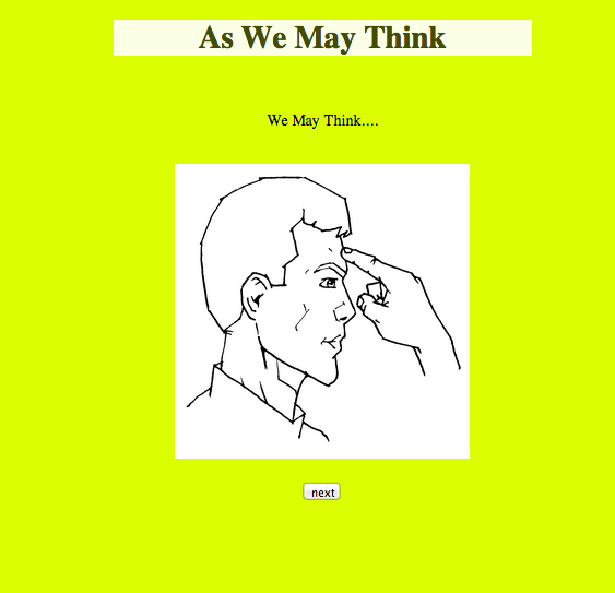
In his 1945 article “As We May Think,” Vannevar Bush basically envisioned the personal desktop computer, the internet, search engines, search history, scanners, and a whole lot more. It’s the end of WWII and he declares it’s time for the world’s scientists to stop focusing on making nukes, and to start thinking about ways to make all of the world’s knowledge easily accessible. Bush believes that access to knowledge—including our “shady past”—will basically help us achieve world peace. How? Well microfilm is getting so micro that he reasons the ability to compress “a billion books” in a way that could be easily copied and distributed to all in not so far off…
Bush’s groundbreaking concept is a “Memex” that would extend human memory to provide access to an index of all human information. He describes something called “trails” that would mimic the way the human brain links things together by association. The process seems to have an aspect of automation, but it is clearly steered by a human who defines the creative aspect or search term or other parameters, then sets the machine off to gather some information while the human digests the infos. Trails are then stored for later use, which makes me imagine a hybrid of a search history and an automatically-generated reading list—a nifty way to organize information. Bush believes that if we can reach a point where machines do the heavy lifting of computing and recalling the material, humans—including scientists and mathematicians—will be much more creative and productive.
I wonder what Bush would make of the Internet where his article is distributed for free on-demand along with billions of other artifacts of the human race. To to make this week’s reading more fun and interactive, I made this hypertext response.
I watched Microsoft’s 2011 Productivity Future Vision before reading Bret Victor’s “Brief Rant on the Future of Interaction Design.” The “Vision” video struck me because of the limited options these imagined systems seem to provide their users. They didn’t seem to allow for much in the way of individual expression because they relied so much on predicting what looked like a very limited set of actions. These limitations make the interactions appear elegant in their simplicity, but lack a “human” feeling even as the video demonstrates a belief that unobtrusive almost-invisible technologies will bring all kinds of people together.
Bret Victor’s “rant”—a response article from a seemingly disgruntled former Human Interface Inventor at Apple—was most concerned by the Vision’s excessive use of hand gestures to control screens he described as “pictures under glass.” None of the screens had any texture to them, and in Victor’s view this Vision neglects the most important elements of human capabilities. As a musician and person who likes to see live music, I think a lot about gesture—the best performances tend to have motion that resonates with the music to create the complete experience. And I’ve never been very impressed by the gestures of a laptop/iPad musician—the best of these types of performers always incorporate some kind of external controller or at least a dance/movement that is a response to the music rather than an interaction. As an iPhone user I had recently been thinking about how much I miss being able to feel the keys as I type. I had never considered quite how elemental this tactile sense can be in our interactions (for example I’m realizing how much I love the way my hands “feel” which page I’m on in a book and how much I wish that I was reading this article in a book…). I’d also never thought about how insignificant the “swipe” gesture that we use to control tables/iPhone/Future Vision interactions is in relation to the “four fundamental grips.” I also took note of Victor’s definition of a “tool” as something that amplifies human capability to allow us to do what we want/need to do, and I’m inspired by his belief that it’s up to us to use existing tools to create new ones that will shape our future.
Chris Crawford’s Art of Interaction Design helped me define “interactivity” and articulate why I am so excited about ITP’s approach. He defines interaction as a cycle of engagement in which two actors 1. listen, 2. think, and 3. speak. Listening requires understanding/comprehension, thinking requires interestingness, and the response (“speaking”) requires clear communication. All three are necessary for the action to be an interaction, there can be no “weak links,” otherwise it might be more like a reaction (i.e. reading a book), or participation (i.e. dancing). The interaction can take place between two actors whether they are human or not, and I love the analogy to conversation.
I had never really understood a distinction between an Interaction Designer and a User Interface Designer, but now I understand that the former is the holistic approach that incorporates both form and function. User Inteface optimizes design (speaking) but doesn’t touch the thinking side of things the way that interaction design does. Crawford believes we are in the midst of a paradigm shift in which a younger, less technical (i.e. math/science) but more “webby” generation of Interaction Designers will draw on their arts/humanities backgrounds while incorporating the wisdom of User Interface to become the new norm. So I’m glad I’m in this program.
For this week’s project, we were asked to make some static image like a self portrait using some basic shapes in Processing.
I was inspired by the idea that Processing makes it possible to do things that aren’t possible in programs like Photoshop. I had been trying to use Photoshop to make lines that increase in size while the spaces between them decrease. It was an annoying process…kind of like making each bar of a prison cell one at a time (this was an example that Shiffman mentioned in class). So I wanted to tackle this with a For loop. From there, I went wild with the shapes.

(100km traffic jam, via the internet post)
Every year, a greater percentage of the world’s population moves to urban areas (source), where traffic is becoming a huge problem. Inspired by the situation in her hometown of Bangkok, Kate thought wouldn’t it be great to fly above the smog? So for our ‘Fantasy Device’ in today’s first session of Physical Computing, where we were invited to invent something that does not exist (and might not be technically feasible), Kate and I came up with a magnetized scooter and rail system called MagRail. The dividing line would become a system of two magnets, and MagScoots would hover above them with a magnetized strip. We don’t know how feasible this is, and at this point we don’t really care. The important things are the MagScoots.
MagScoots are 2-person scooters with a magnetized strip at the bottom so they can hover on the MagRail system. They have a luggage container in the back that doubles as a seat for a second passenger. They have handlebars at the front and only one button with two settings: On and Off. When they are Off, the magnet is shielded and the MagRail’s powerful magnets have no impact. When they are turned On, the magnet is revealed and a light activates in the back so that they can be easily seen by other MagScoots. They have a motor in the back that propels the MagScoot forward at the same speed as all other MagScoots. They also have sensors on the top, bottom, front and back that detect when other MagScoots are nearby to avoid accidents during takeoff and landing. Takeoff and Landing (the transitional moments between Off and On) are the most important moments for MagScoots. During Takeoff mode, if sensors detect that it is safe for takeoff, the magnet shield flutters back and forth to gradually expose the magnet that will raise the scooter at an appropriate velocity. This flickering also impacts the light at the back of the MagScoot. During Landing, the shield flickers again to lower the MagScoot in safe increments. For more, check out Kate’s write-up on the MagScoot.